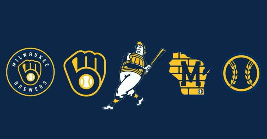
Last night at Miller Park, the Milwaukee Brewers unveiled a new set of logos and uniforms for the 50th anniversary of the Seattle Pilots moving to Milwaukee, and it's all I can think about.
Granted, I am a massive Brewers fan and the only other notable baseball news right now is the ongoing Houston Astros' sign-stealing drama but with a heartfelt video narrated by team manager Craig Counsell and a delightfully cheesy hashtag in #glovestory accompanying the rebranding, there is palpable hype surrounding the team over this change despite the primary logo being leaked a few weeks back.
Heritage. Hustle. Heart. Wisconsin, this is for you. #glovestory
— Milwaukee Brewers (@Brewers) November 19, 2019
Full story: https://t.co/s1QGbQQK8q pic.twitter.com/RBoDpwcRc9
The new logos replace the primary "M" logo which the team has used since 2000 as they began playing at Miller Park; and while the visual similarities to the Miller logo were nice, it inevitably became outdated in the near 20 years since and thus a change felt necessary. Returning to the "ball-in-glove" motif introduced in the late 1970s as the primary logo also makes sense as it has long been preferred by fans and feels as though it belongs to the fans — it was designed by a UW-Eau Claire student.
So, as a Brewers devotee and someone who obsesses over logos and branding given my art degree, I'm going to do my best to grade all of the Brewers new logos and uniforms in hopes that I can make sense of why this rebranding is so exciting.
The Logos
Primary Logo
It's hard to improve on the perfection of the original "ball-in-glove" logo but the madmen somehow did it.
The ball is now centered in the "B" (something which I can't unsee when looking at the original), and divides the glove into three segments that, according to the Brewers' official site for the rebrand, represent the fans, city, and state, which are central to everything the organization does. The "M" and "B" are now connected, a detail which I initially disliked before learning that it is meant to represent the connection between the city and the team and now my heart is full.
And even the royal blue of the original "ball-in-glove" era makes a small cameo in the inner circle of the logo!
Grade: A
State Art
The first secondary logo is based on one of the team's oldest logo motifs which places a blue "M" over the state of Wisconsin. Cream City bricks make up the background and a baseball is placed on Milwaukee. In addition, the "M" matches the new industrial font which the team uses on their jerseys — a nice touch.
While not my favorite secondary logo the Brewers have used, the Cream City bricks and the baseball indicating Milwaukee's location and the team's plans to stay in the city make this the best version of this logo in my opinion as it moves beyond simply stating "WE'RE FROM WISCONSIN."
Grade: B
Wheat Ball
An entirely new logo, the perfectly named "wheat ball" retains what was arguably the best part of the Brewers' previous logo: the barley accent. This obviously brings to mind Milwaukee's brewing history which gives the team their name and recontextualizes them as the seams on a baseball.
This logo is so perfect in its simplicity and uniqueness that I almost wish it was the new primary logo, but I realize how important the "ball-in-glove" logo is to generations of fans. I'm already budgeting for all of the hats I'm going to buy with this beauty on it.
Grade: A+
Full Barrelman
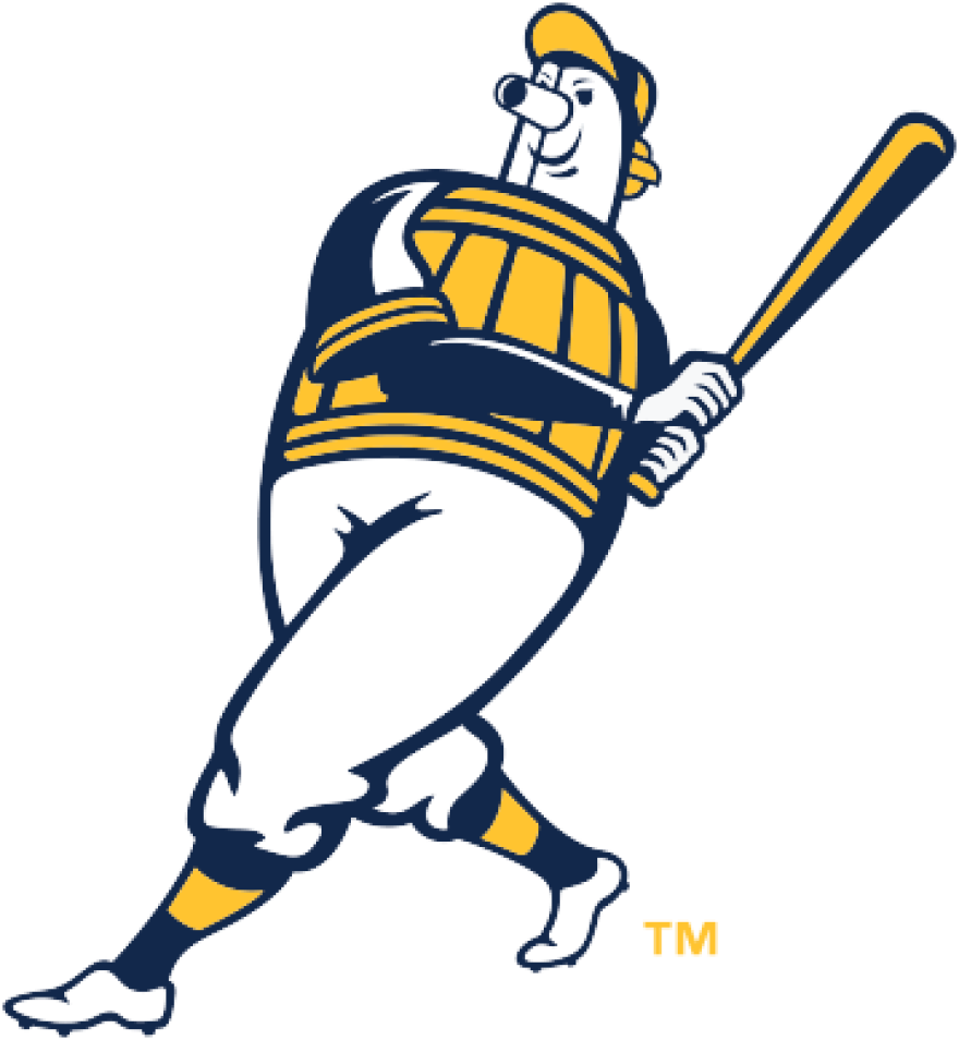
I've always wondered about the origins of Barrelman. I don't mean the origin of his creation (he was originally created as a mascot for the minor league Milwaukee Brewers in the 1940s and known as "Owgust," in case you were wondering) but instead how he came to exist.
Is he kind of like a Minotaur-esque creature with a barrel top-half and a human bottom-half? Is he simply a man dressed as a barrel? Was he a barrel given life like Frosty the Snowman or Pinocchio? While this new logo doesn't answer any of my questions regarding Barrelman lore, it does bring back the Brewers first logo with a new color palette, slight detail changes and more shadows.
I definitely dig it as it makes a cartoon barrel person a little more contemporary and intimidating for the 21st century but it's a little out of place when compared to the other new logos because of its complexity, which I worry will be lost unless it's seen on a large scale.
Grade: B-
Partial Barrelman
The final new logo again uses the mysterious Barrelman as a base but focuses on his head and face. He now has a little more attitude and some fierce winged eyeliner (at least that's my theory) in addition to retaining the same color palette and shadows of the new, full Barrelman.
Unlike the full Barrelman, the disembodied head of this icon is much more in line with the simplicity of the other logos. Focusing on the more aggressive face helps to reinforce that the Brewers are not a team to underestimate.
I really appreciate this logo but I fear it may be confusing to people who don't know who Barrelman is. Although maybe the less known about the peculiar Barrelman, the better.
Grade: B+
The Uniforms
Home Cream
Referencing Milwaukee's nickname as the "Cream City," the new primary home uniforms ditch the white base for a cream color and welcome back the wide piping around the sleeves which was seen in the 1970s jerseys. The font used for the team name is also a reference to the city's industrial heritage and the same as seen in the state art logo.
While I tend to dislike cream uniforms due to it often looking like a dirtied white, the blue and yellow of this jersey contrast really well with the cream and bring out the retro tones perfectly. The wheat ball on the sleeve is a nice touch and helps to reinforce the cream color too.
Grade: A-
Home Pinstripe
I was really worried that with new uniforms would come the loss of the Brewers' iconic pinstripes, which have seen a resurgence in popularity after the team's viral "Mean Girls" parody from last year. I can't just STOP saying "On Fridays, we wear pinstripes!"
Thankfully, my worries were unfounded and the design is largely unchanged. The uniform now features the same industrial wordmark as the home cream as well as the wheat ball. Perfect remains perfect.
Grade: A
Road Gray
The "gray sheep" of the uniforms, the road gray is the least vibrant of the new unis. Even with the thin piping around the sleeves and state art above it, used to symbolize the team's duty to play with state pride, this is my least favorite of the four. It's decidedly less retro-inspired than everything else introduced and while the industrial "Milwaukee" does contrast with the gray, it still seems too dull.
Not bad at all, but not phenomenal.
Grade: C+
Road Navy
In contrast to the road gray, the road navy uniform is simply electric. Thin yellow piping on the sleeves and down the front complement a gorgeous industrial script lettering which is both bold and elegant, while subtly calling back to the Brewers preceding wordmark. It's also not seen anywhere else in these new assets.
This uniform is arguably unlike anything the Brewers have worn before and suddenly at the top of my Christmas list.
Grade: A
The @Brewers logo lineup. 🔥 pic.twitter.com/ZKwrOgoMrR
— MLB (@MLB) November 19, 2019
Throughout last night's press conference, a common thread was that the redesign is for the fans. And after looking at every new element, it's hard to argue with that sentiment. With aspects of every design referencing either Milwaukee's past or present with a visual eye toward the future, it is obvious that a lot of care went into this face-lift.
It continues to be an exciting time to be a Milwaukee Brewers fan and it will be exciting to see what else the team has in store for its 50th anniversary season, even if my wallet is a little afraid of this new aesthetic era.


